
Redesigning Laika’s Navigation Bar
This project is under NDA. Below is a summary. Reach out for process and final designs ✌🏼🤍
What
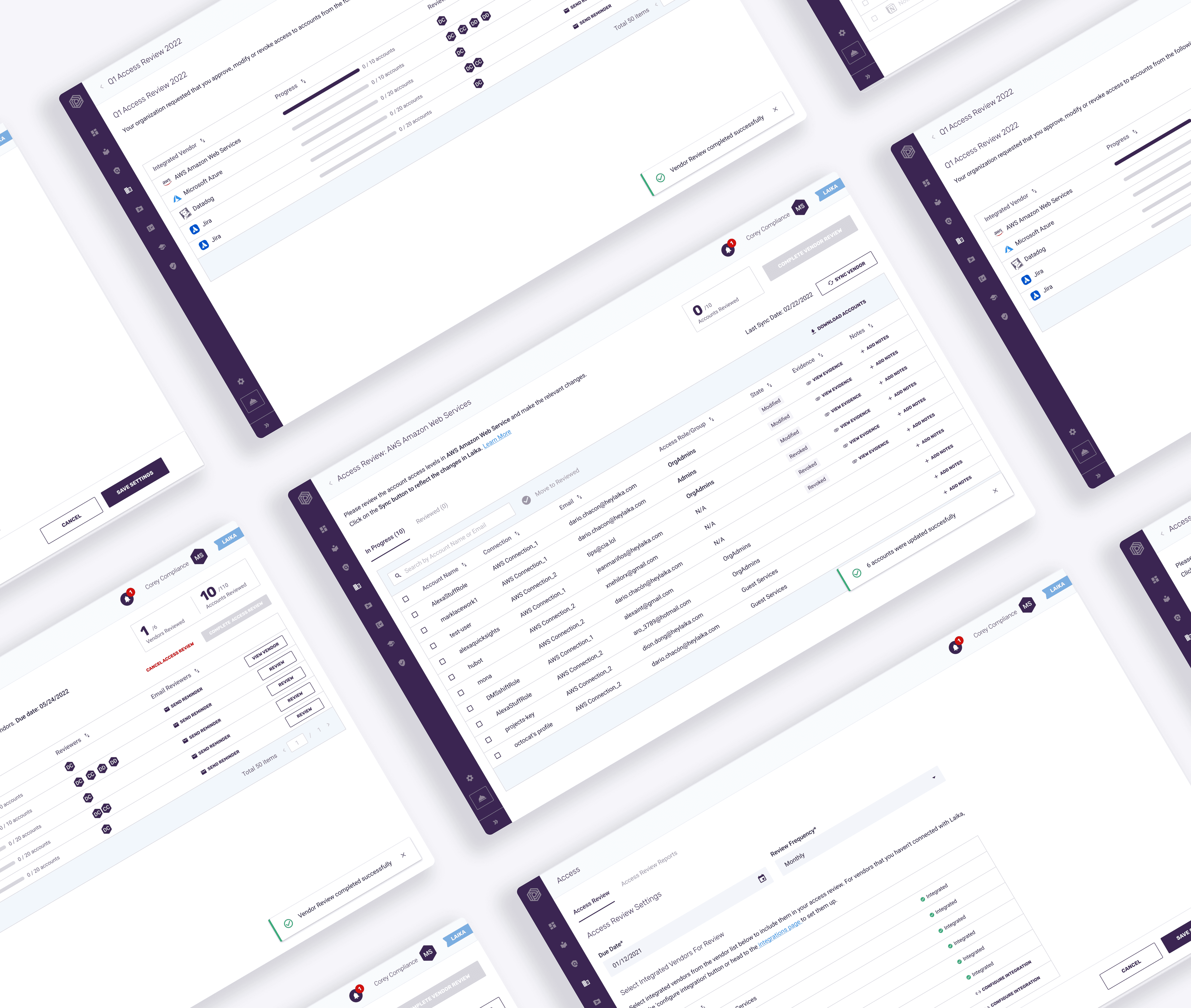
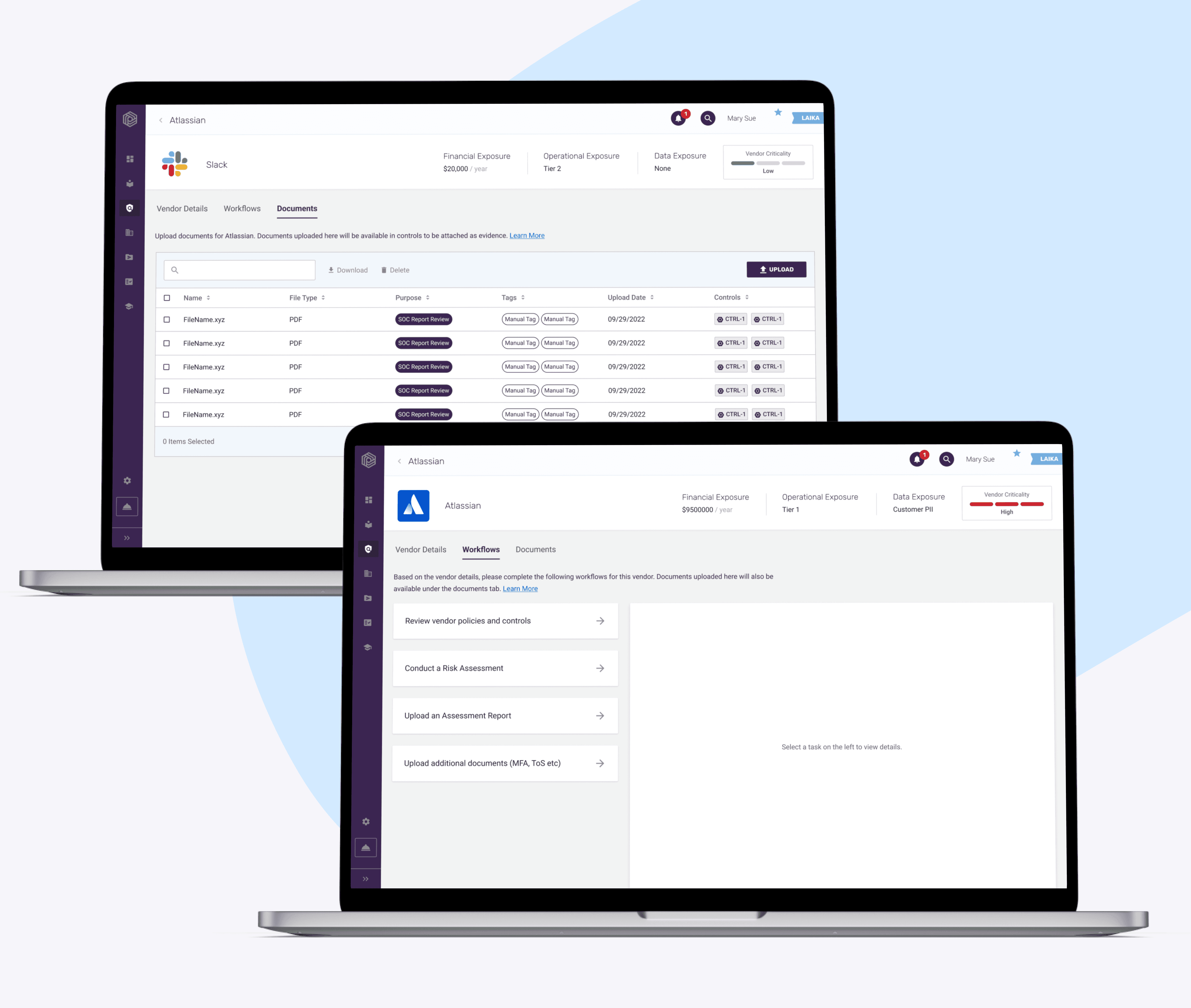
Laika helps startups build and automate info-sec compliance programs. I was the lead designer on the global nav redesign initiative to improve in-app navigation.
Why
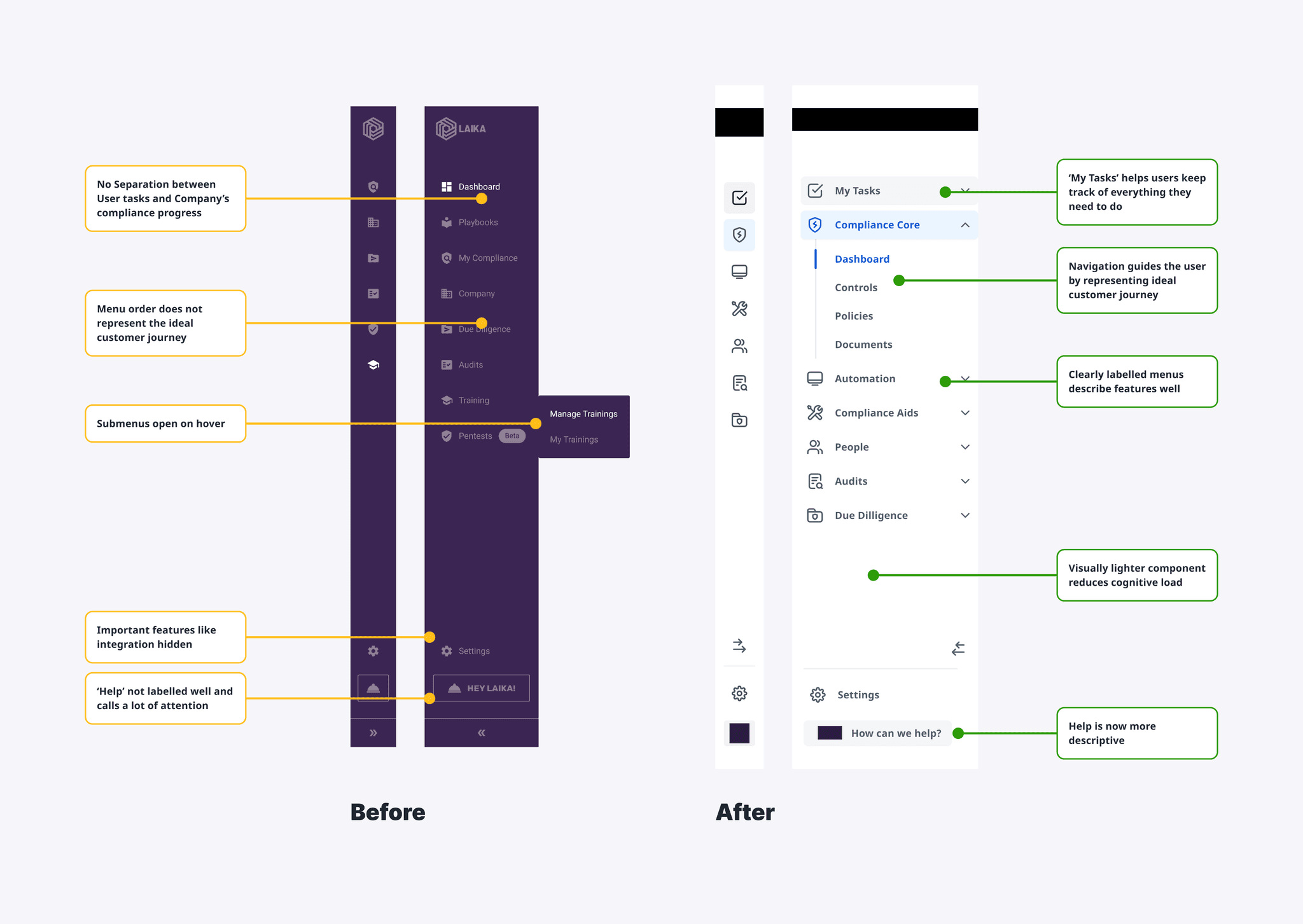
Customer calls, sales meetings and help center tickets surfaced problems with Laika’s navigation bar. Further exploration of the problem revealed that the navigation didn't follow our ideal customer journey, nor did it promote features crucial to user success leading to adoption and retention problems.
How
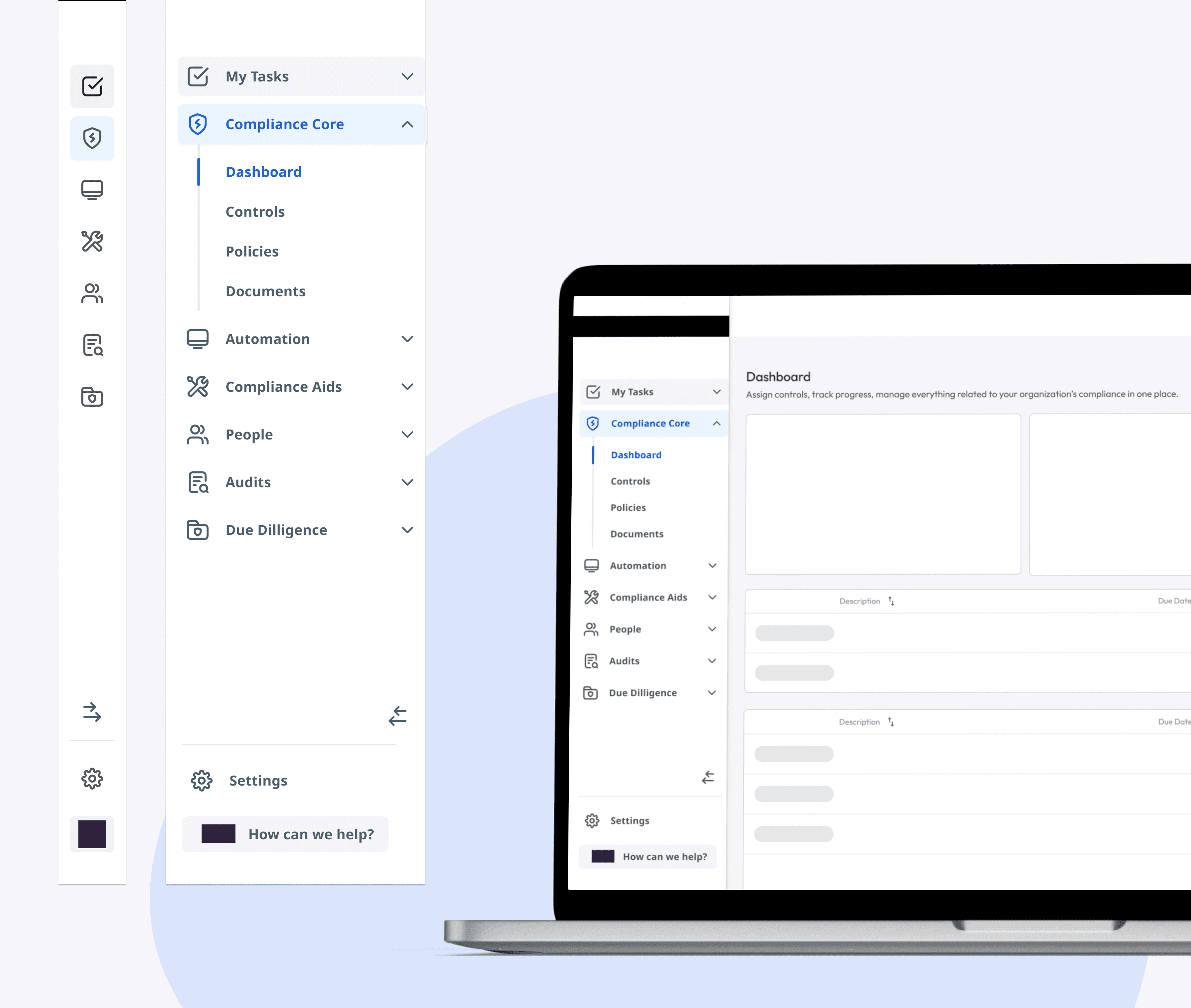
As the lead product designer on the team, I worked cross-functionally with our UX research team, product team and customer facing CX and sales teams to conduct extensive user research. Iteratively we arrived at a new navigation structure . We also tested different UI designs with label updates to better describe product offerings.
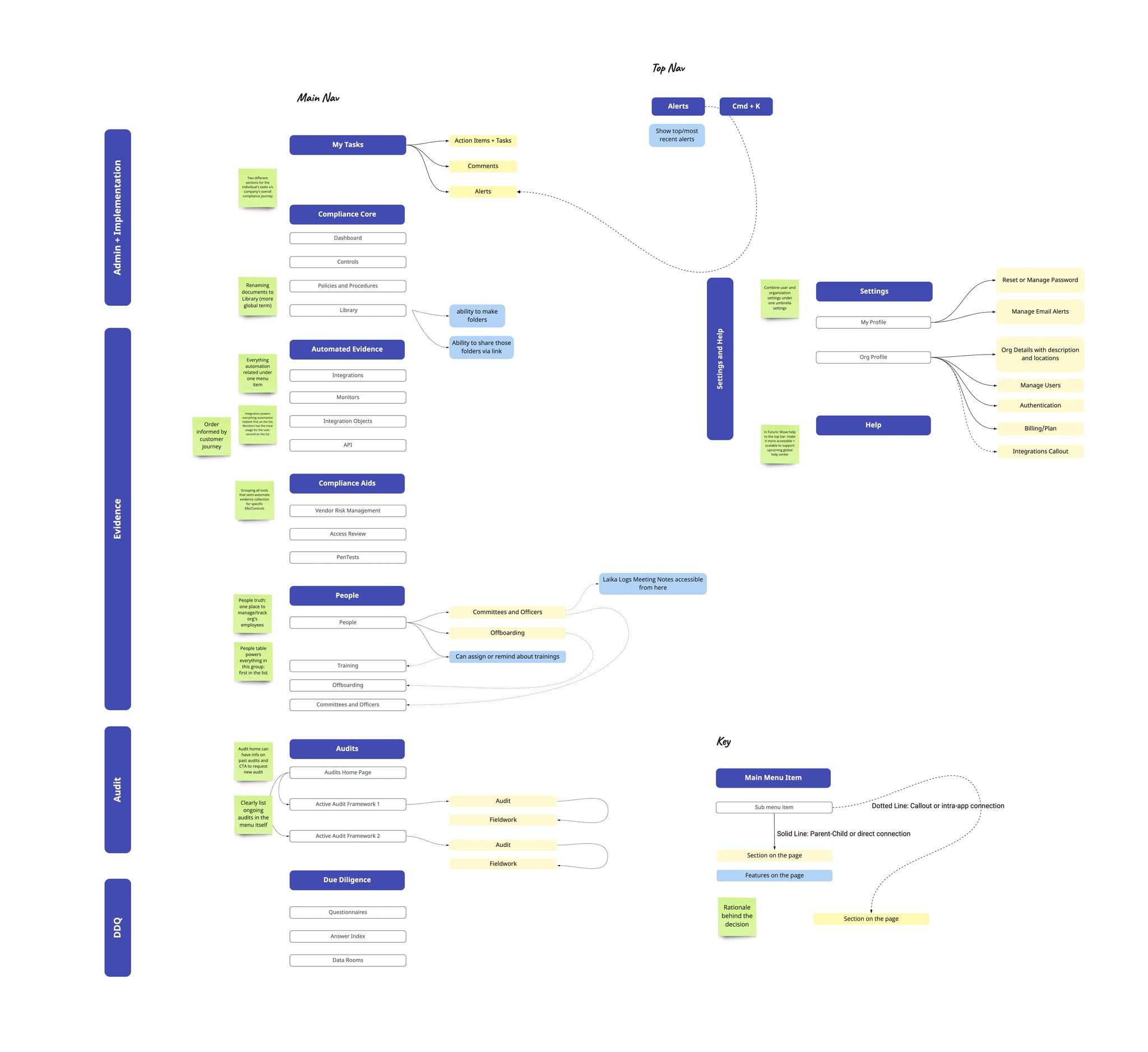
We went through several iterations of the navigation structure by involving cross-functional stakeholders from engineering, content, product and customer-facing CX teams. Image above shows the final structure of the new navigation which will be tested with users over next two quarters. Software Used: Miro
Potential Impact
By improving the navigation to better represent the customer journey, we are hoping for better adoption of features like integrations and monitors. We will also work with sales representatives to craft a better narrative using the new nav structure. UI updates will be made incrementally based on user feedback after testing.
Continuous Improvement
We are currently testing the new structure through user tests and customer interviews. I'm also working with the design systems team to optimize the new navigation component and planning for a beta release of the new structure by the end of next quarter.